Biletiniz
Designing one booking system
for two different ways to travel.
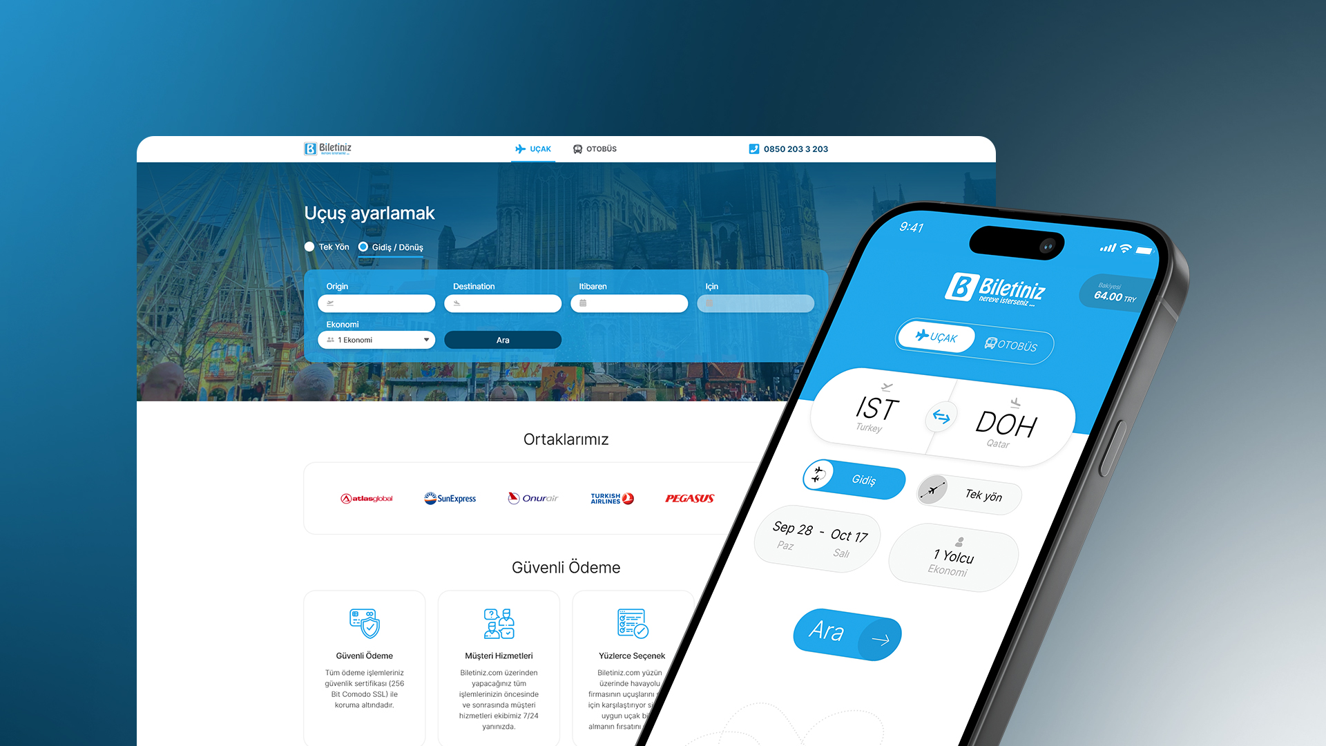
Biletiniz is a Turkey-based platform for searching, comparing, and purchasing flight and intercity bus tickets.
As the sole product designer, I designed the web application and mobile app from scratch in Adobe XD. The initial product was completed in three months, beginning with desktop and then extending the system to mobile.
- Role
- Sole Product Designer
- Year
- 2022
- Initial duration
- Three months
- Platforms
- Desktop Web · iOS · Android
- Scope
- Product Strategy · UX/UI Design · Interaction Design · Responsive Design · Illustrations · Iconography · Transactional Emails · App Store Assets · Social Media
- Tool
- Adobe XD
One platform. Two different ways to travel.
Biletiniz needed to bring flight and intercity bus booking into one connected product.
Both journeys move from search and comparison to passenger information, payment, and ticket confirmation. But the decisions inside them are different.
Flight customers need to understand airports, connections, baggage, cabin classes, fare rules, and multi-leg itineraries. Bus customers need terminals, onboard facilities, cancellation conditions, route stops, seat layouts, and seat availability.
The challenge was to create one recognizable booking system without forcing both services into an identical experience.
Keep the structure familiar while changing what matters.
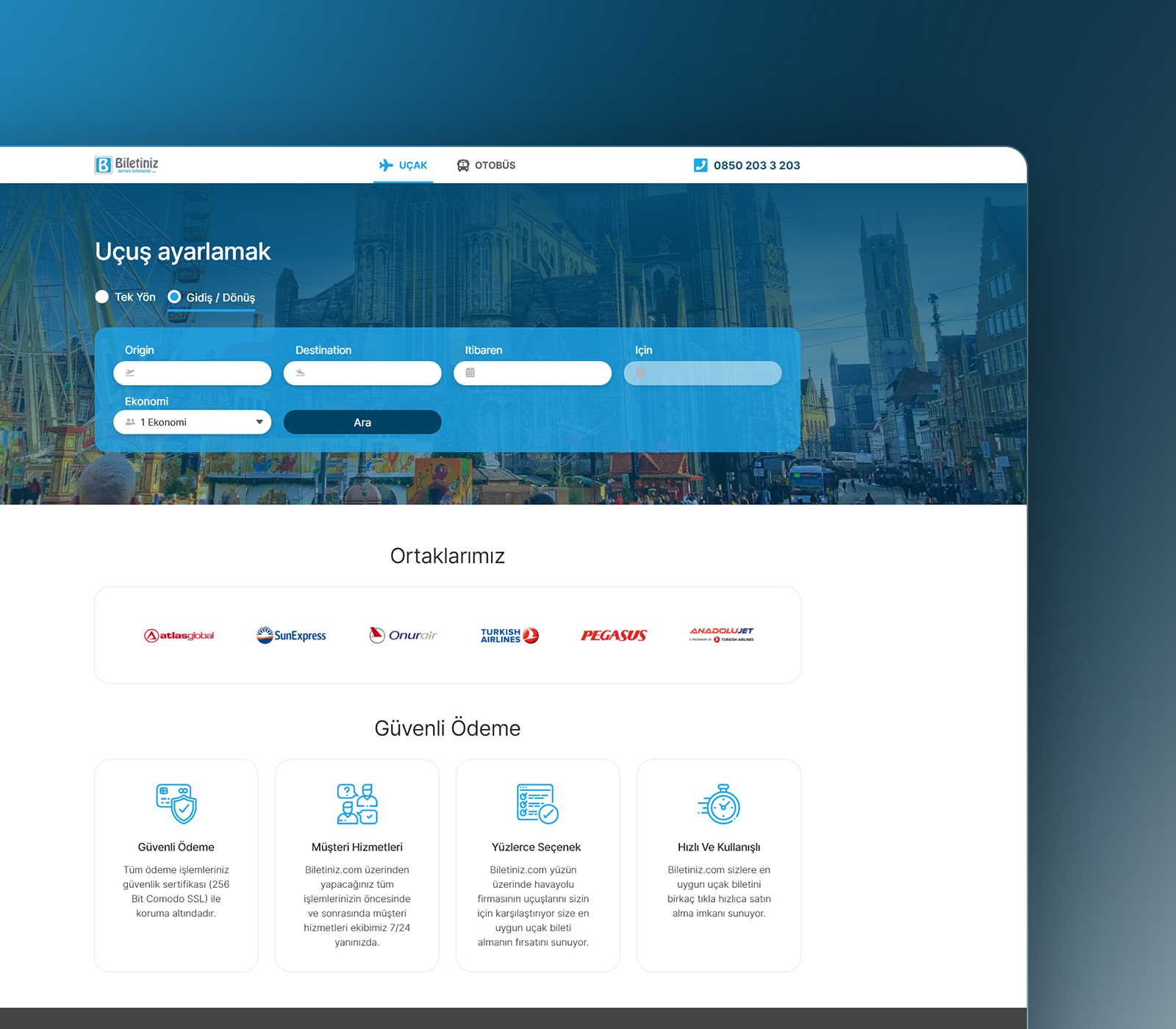
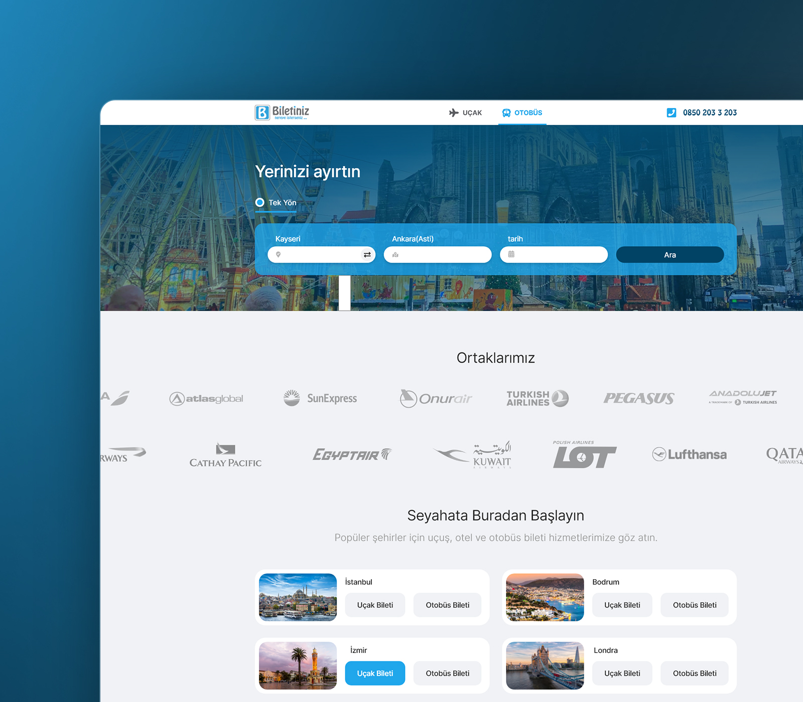
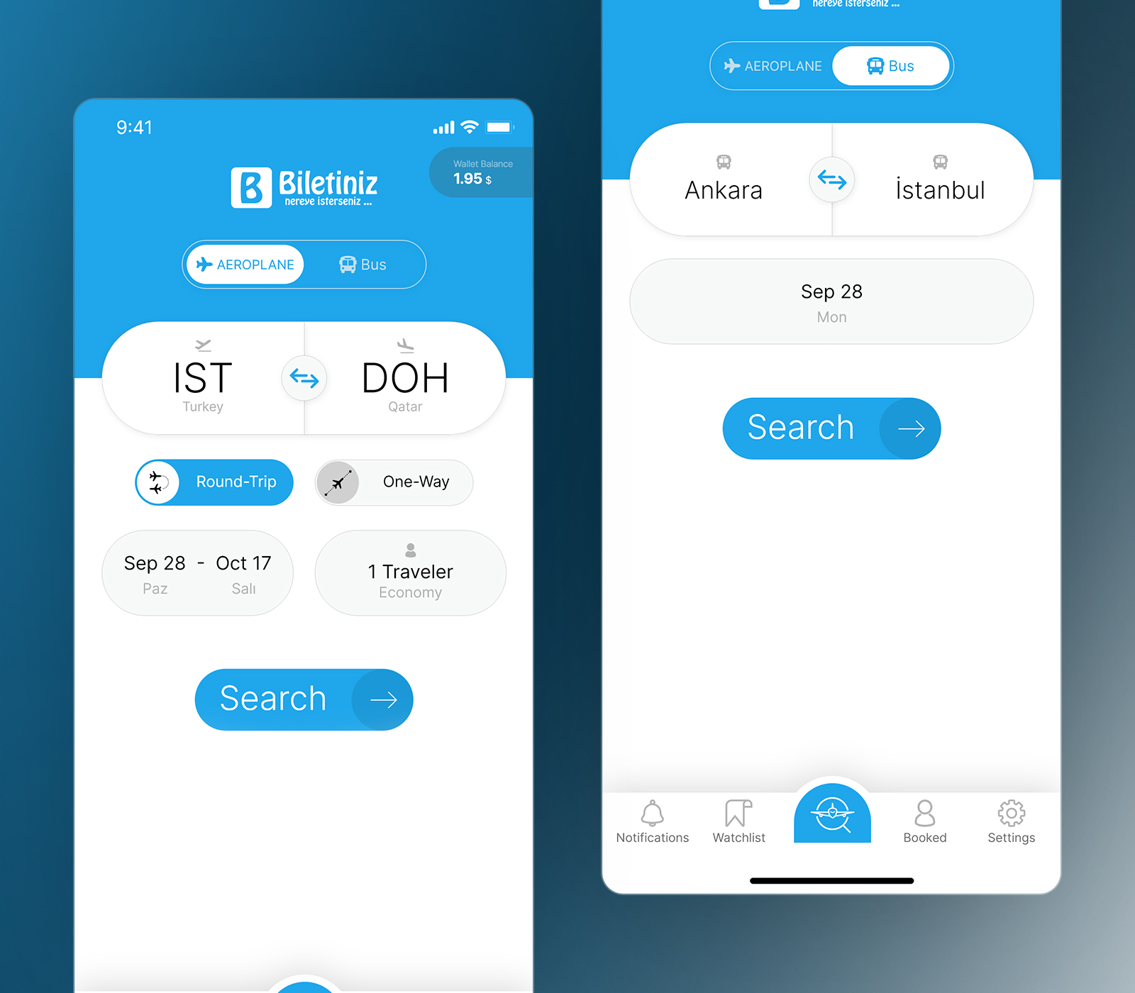
A prominent switch allows customers to move between flight and bus booking.
Both experiences share familiar controls for origin, destination, travel date, direction changes, and search. Flight booking introduces return journeys, passenger count, and travel class, while bus booking remains focused on terminals and departure date.
The shared foundation helps customers learn the product once while allowing each travel type to retain its specific requirements.
Making complex choices clearer
Make comparison simple without hiding important details.
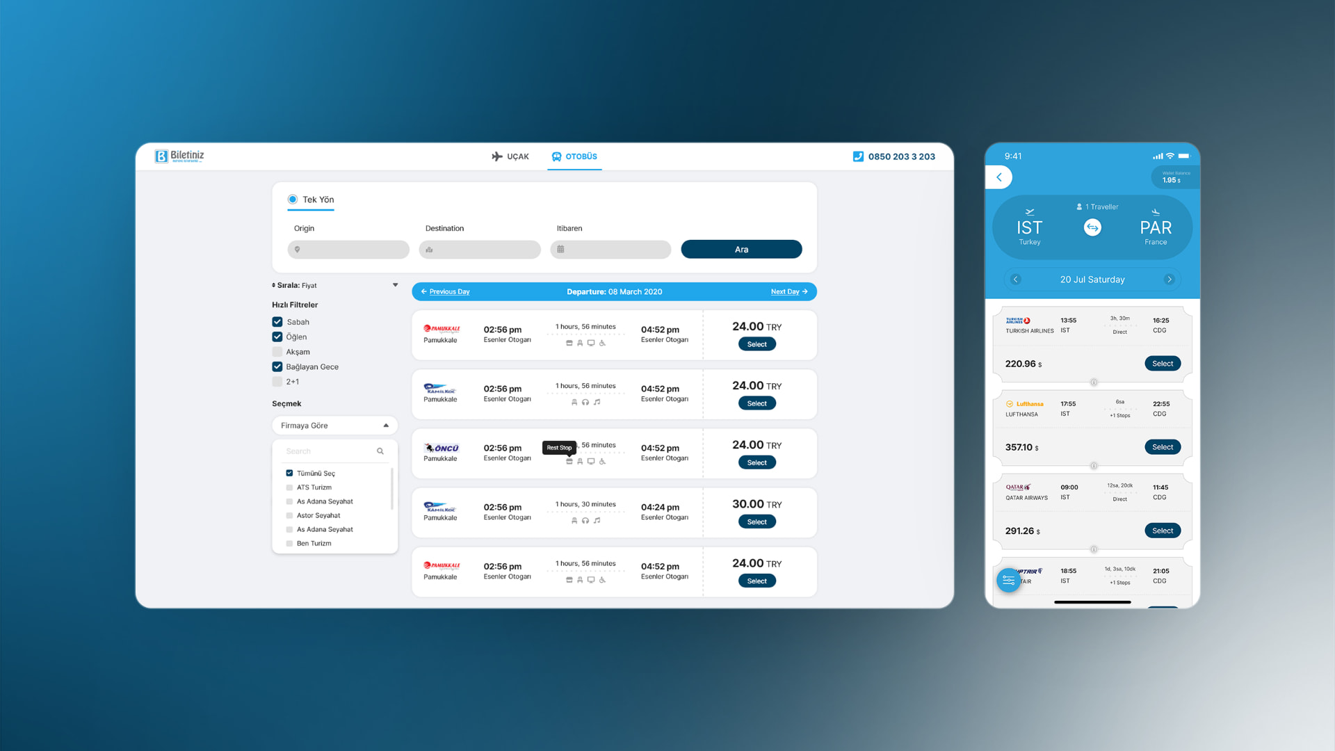
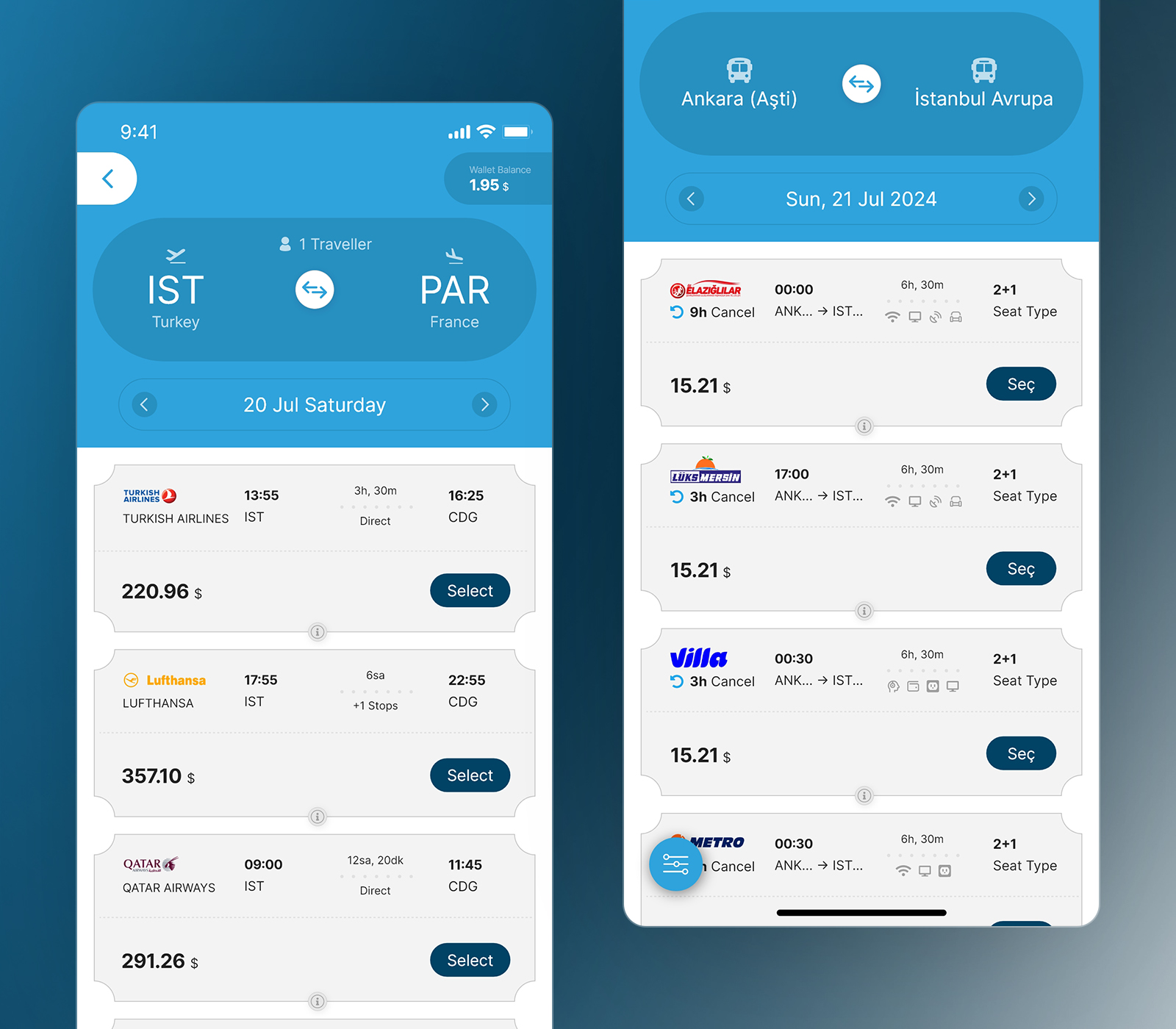
I designed ticket-inspired result cards that make operators, departure times, duration, connections, facilities, prices, and primary actions easy to scan.
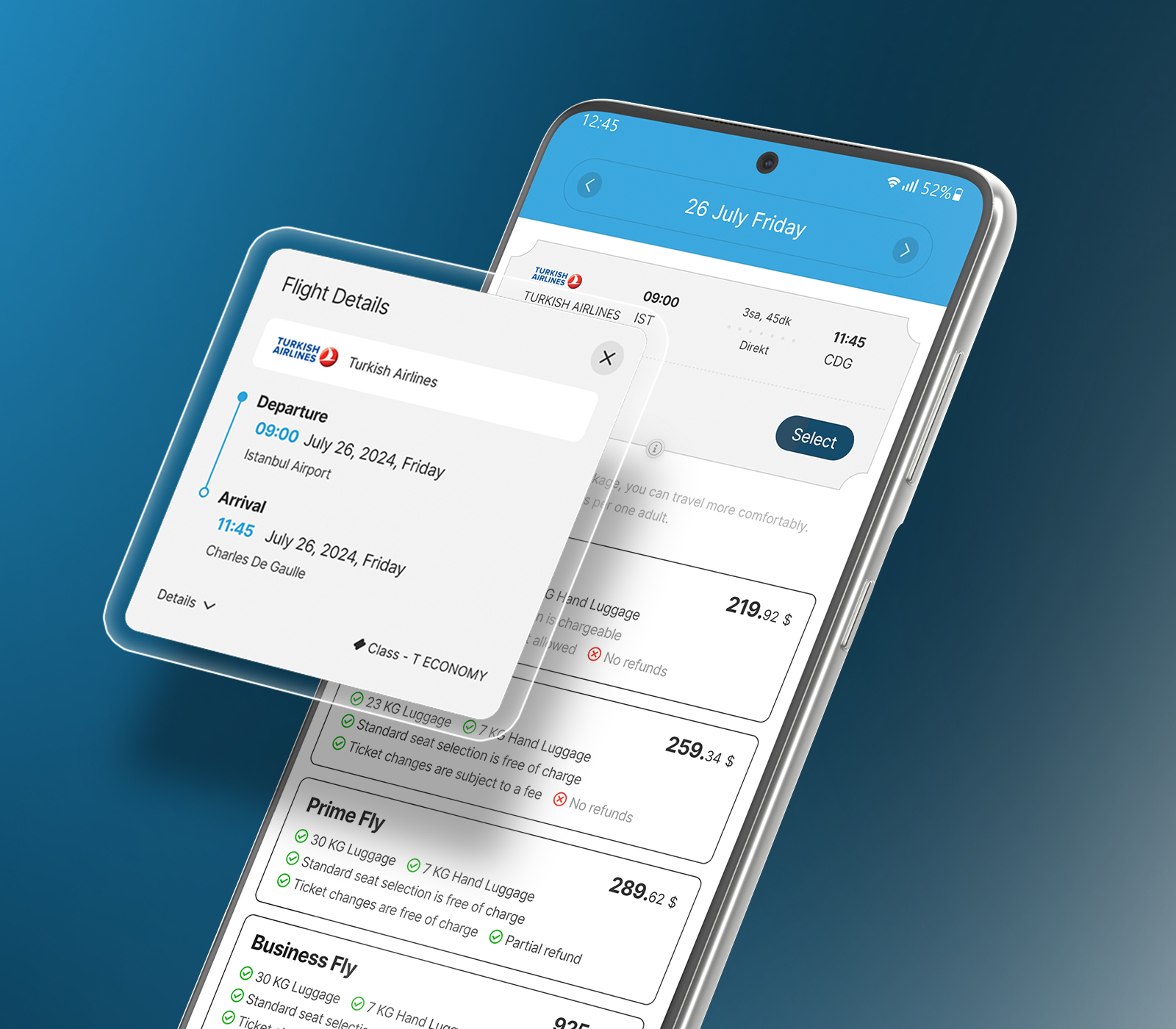
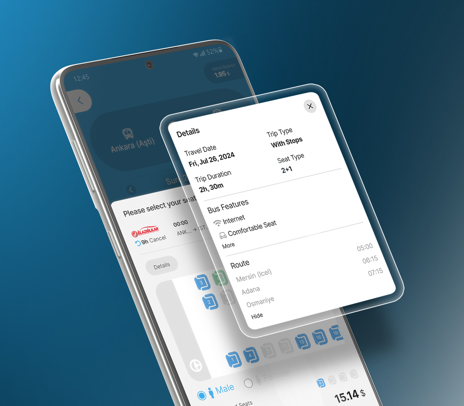
Flight and bus results share a consistent structure, but each prioritizes different information. Additional details are revealed progressively so customers can inspect flight segments, stopovers, bus facilities, or route stops without losing their position in the results.
The same approach supports more specialized decisions:
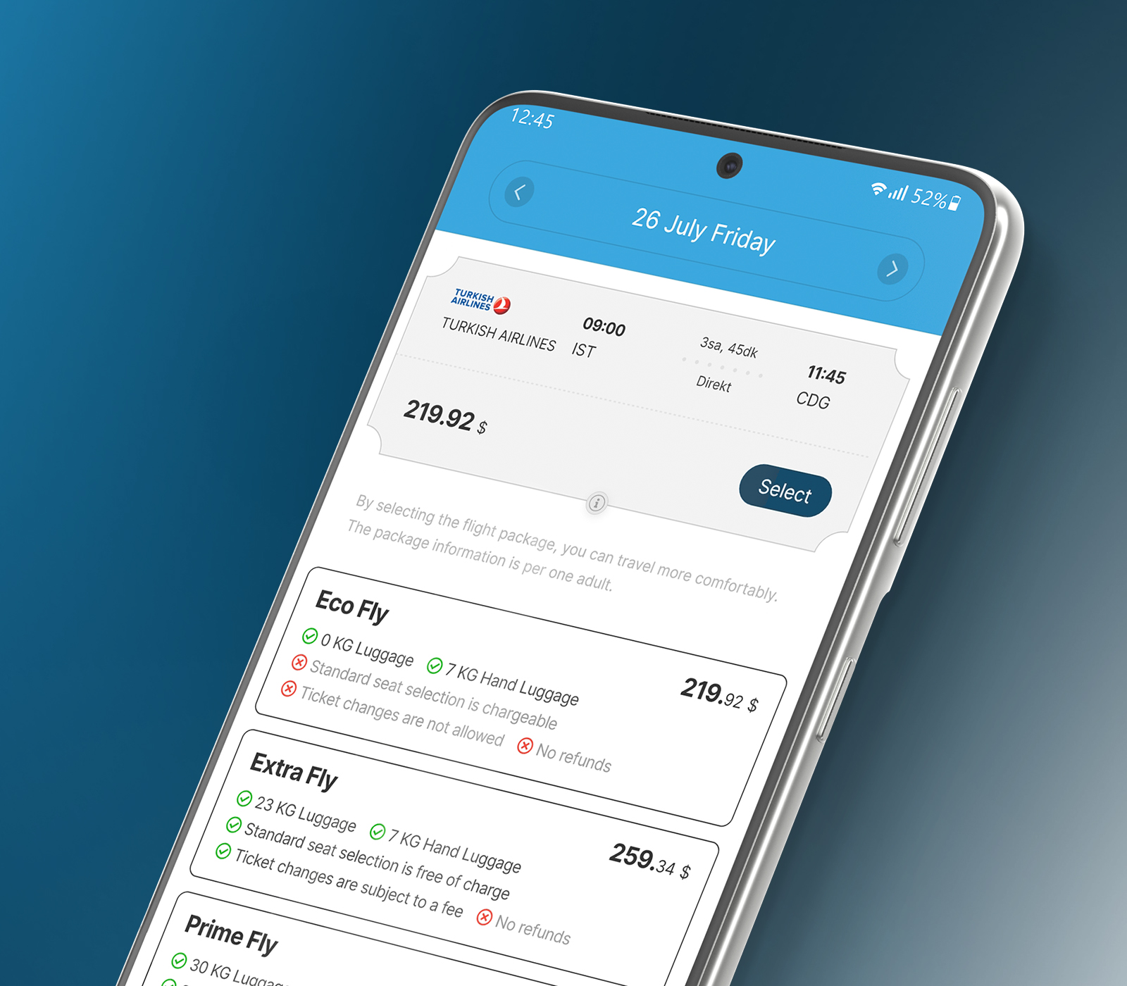
- Flight-package comparison makes baggage, seat selection, ticket changes, refunds, and price differences visible.
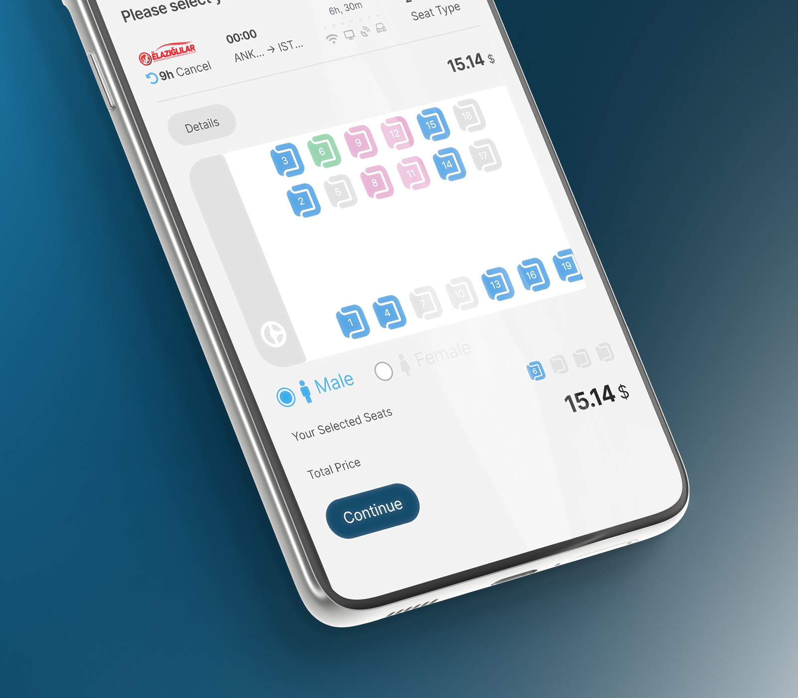
- Bus-seat selection turns the vehicle layout, availability, selected seats, and total price into a direct visual interaction.
- Results
- Travel details
- Flight packages
- Bus-seat selection
Completing the booking journey
Support the customer from selection to ticket.
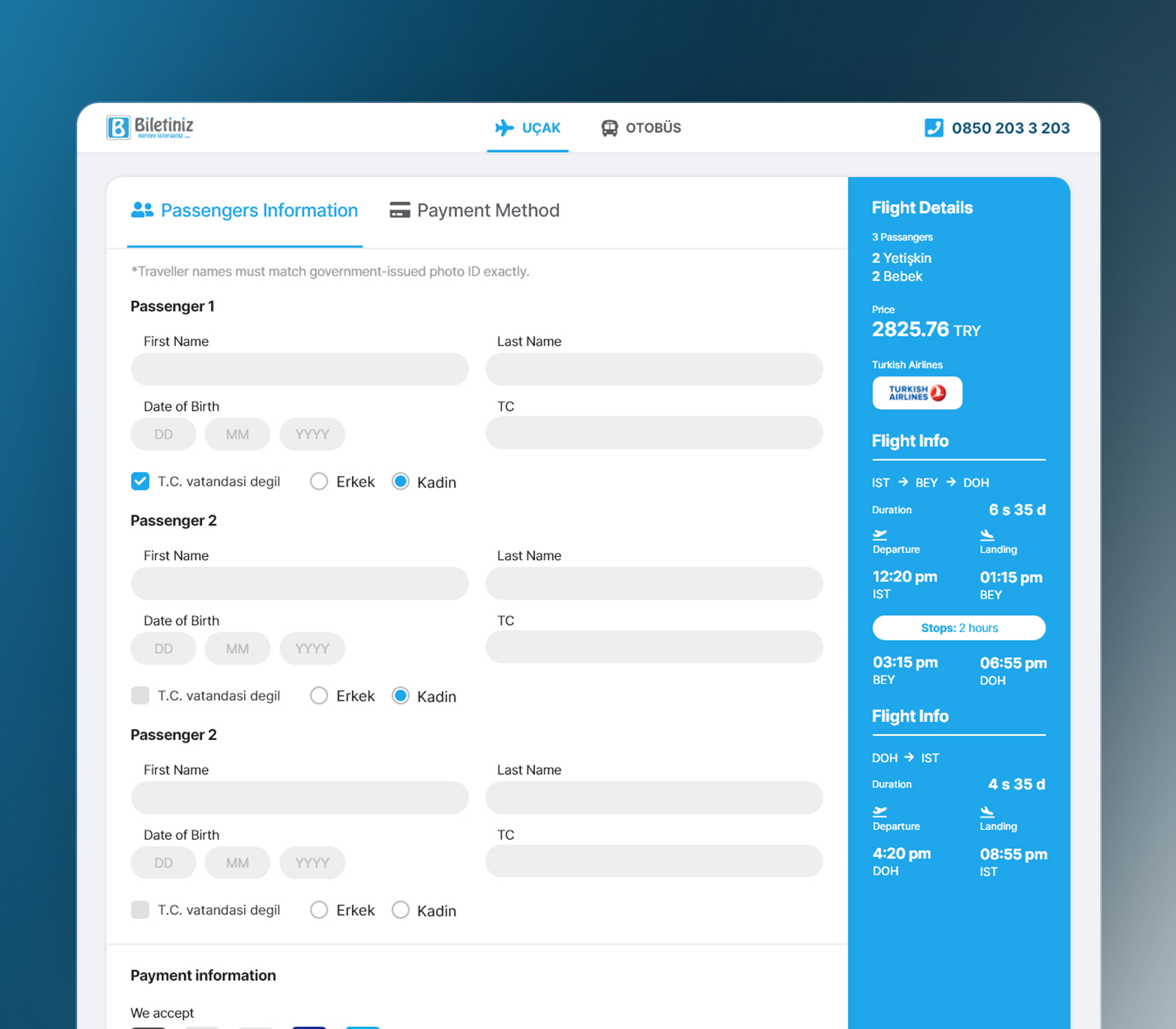
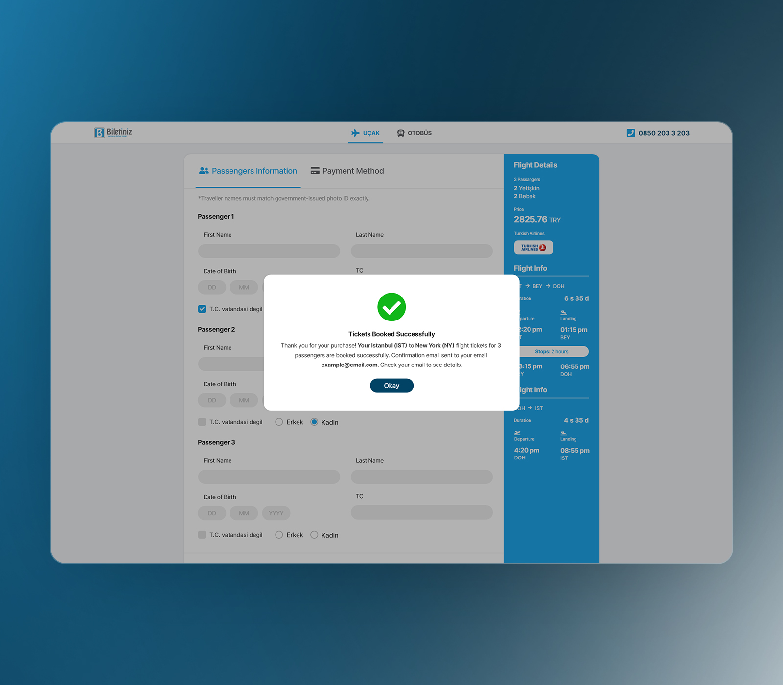
During checkout, a persistent journey summary keeps the route, passengers, times, connections, and total price visible beside the passenger and payment forms.
Inline validation identifies problems close to the relevant field, while page-level messages explain when multiple errors need attention. I also designed the states surrounding the ideal booking journey, including loading, no results, no internet, form errors, and successful purchase.
After booking, customers can review passenger and itinerary details, download a PDF, resend the confirmation, or send the ticket to another email address.
Beyond the product interface
Carry the product into app stores and social media.
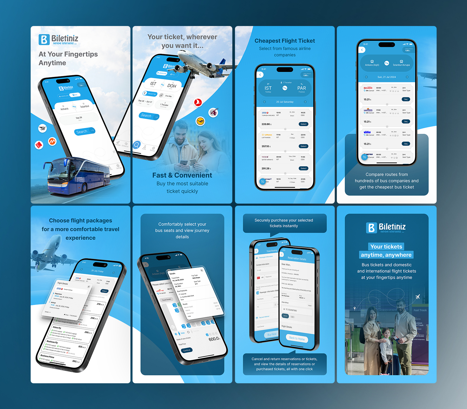
My work extended beyond the web and mobile booking experience. I created the App Store and Google Play graphics used to present the app, communicate its flight and bus features, and help potential customers understand the product before downloading it.
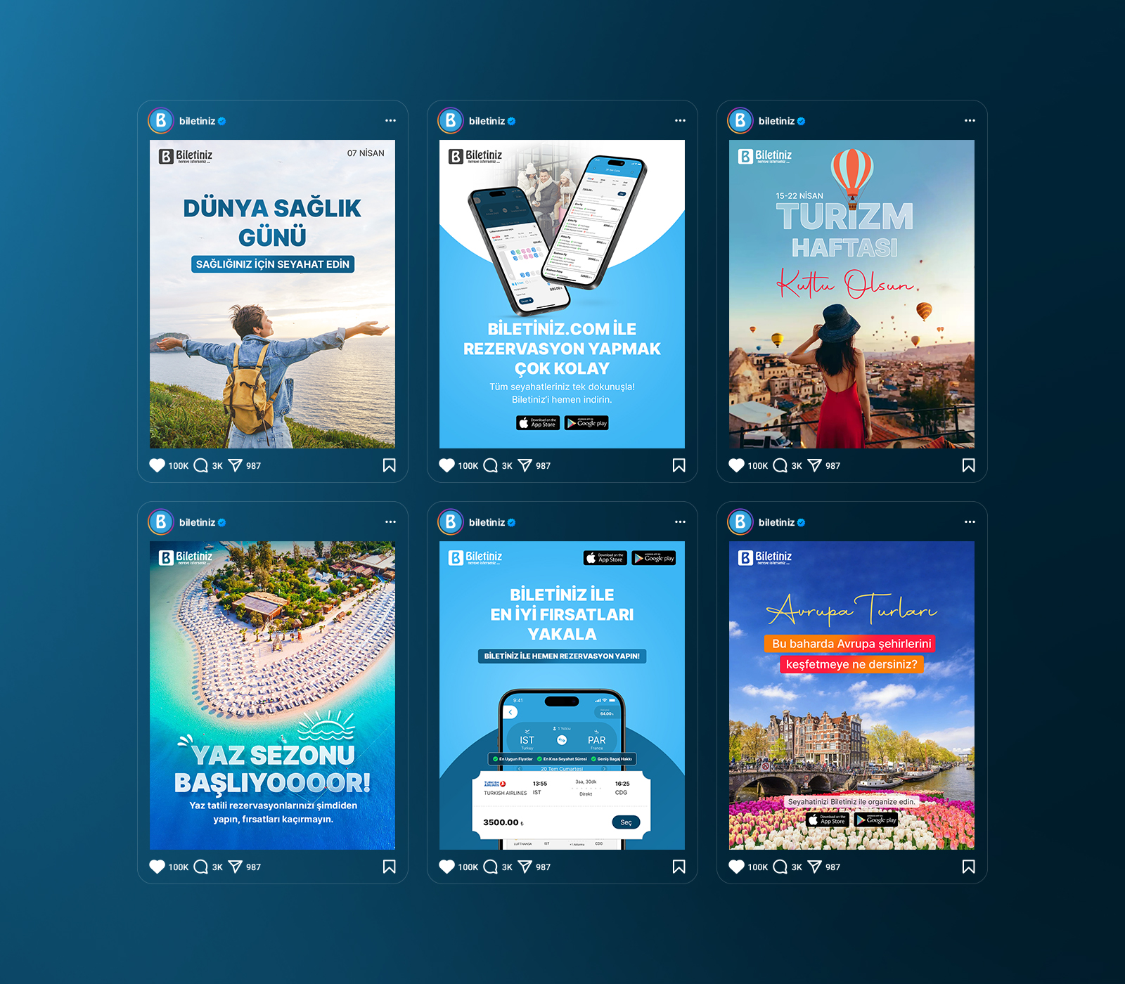
I also designed social media graphics, custom illustrations, icons, and transactional emails. These touchpoints carried the same visual language beyond the interface, creating a more consistent experience across product promotion, app discovery, booking, and post-purchase communication.
The first release became a foundation for continued development.
The initial desktop and mobile products were completed within three months.
After launch, the client continued returning whenever new functionality or visual updates were required. The original flight-and-bus booking structure became a foundation the product could continue extending rather than replacing.
Client Feedback
“We highly recommend Muhammad to anyone needing a top-notch UI/UX designer. His skill in crafting beautiful, user-centered designs and his professionalism throughout the project make him an excellent choice for any mobile or web design needs.”
Outcome
One product foundation across travel, platforms, and languages.
Biletiniz launched across web, iOS, and Android as a complete flight and bus booking experience.
Starting from a blank canvas, I designed the shared booking system, travel-specific interactions, payment and validation flows, failure states, post-purchase tools, transactional communication, and supporting store assets.
The result was not simply a collection of screens. It was one product foundation capable of supporting different forms of travel, multiple platforms, two languages, and continued feature development.
Next project
ScanX AI→